Willow Wood Community Nursery & Primary School Rebrand Project
One of our most recent school rebrand projects saw us working with Willow Wood Community Nursery and Primary School based in Winsford. Willow Wood consulted Education Office as they wanted to increase the visibility of the school as a high achieving and inclusive school and modernise the school’s identity to reflect a more contemporary learning environment.
The Headteacher at Willow Wood, Mr Martin Bell left us some fantastic feedback regarding the work that our team has created:
“From the outset, the team at Education Office were scrupulous in their determination to understand our needs. After initial discussions and thorough research, the team was able to provide us with a number of design ideas that fully matched our brief. Education Office was fantastic in helping us see the differing benefits of each design to match fully with what we wanted to achieve. We were delighted with the finished product. Our new signage was installed promptly and to an exceptionally high standard.”
Working closely with Willow Wood, we were given the task of revamping their brand and logo and updating their current signage. We wanted to create a new identity that would be well received within the community placing Willow Wood as one of the top primary schools to visit as a parent, prior to deciding on where to place a child.
School Logo Design
From early conversations, it seemed clear that an inclusive, adaptable and simplistic logo was needed, and so forth we presented 4 different logo concepts.
Option 1: Willow Tree Concept
We based our initial concept around the Willow trees, that the school is synonymous for. Taking a modern approach, we created a more minimalist style for the tree and wanted to focus on the leaves representing all of the different children within the school; we did this by using an array of different colours to represent the unique personalities that every child has. With the new icon style created, we used a clean and modern sans serif font to complement the icon, which was then underpinned by the strapline.
Option 2: Bold Lettering
A very modern approach was taken with this option, with the focal point being all about the ‘W’ and how we could adapt it to be unique. By dissecting the letter, we created bold shapes with the addition of the leaf to tie into the school name. A very clean option where the lettering complemented the design and gave the same feel as the icon.
Option 3: A Unique Fingerprint
The children were the focus for this logo, playing on the point that every child is unique. We found the fingerprint to be the perfect representation for this, by adding the leaf at the center of the fingerprint, we felt this showed how the school is at the center of the children’s learning. A more traditional serif font was selected to complement and challenge our client while bringing a traditional feel to the overall logo.
Option 4: Weaving In Two Elements
A combination of the children and leaves was considered, bringing the two elements together into one shape showed how the school and children work together to create a thriving learning environment. Simple in its approach, the icon was made to be simple and easy to understand for all viewing it, underpinned by a bold sans serif font to sign off and a strapline focusing on the flourishing of children within the school.
New School Uniform
After designing a variety of logos, we helped the team at Willow Wood with the branding of their new school uniform and created mockups with the different options to choose from. After deciding on option 1 as the new school logo, we helped aid the whole process of sourcing high quality school clothing. From ensuring the logo was print ready and suitable for embroidery, liaising with the manufacturers and discussing the best colour options for the various items needed including jumpers and shirts. Take a look at the final products below.
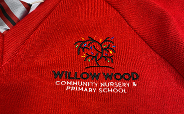
The school colours are primarily red so we worked around that as the main colour within our palette adding complementary colours that would not take away from the boldness of the red.
After much discussion with our client, the final decision was made and option 1 became the new logo for Willow Wood Community Nursery & Primary School.
School Signage Rebrand
Designing, Manufacturing & Installing
Often when we create new branding for a school, we have the opportunity to raise the profile of the school through distinctive signage. As part of the rebrand, we also designed, manufactured, and installed new signage across the school.
Initially, this process started off with a site visit which included a client consultation and measure up of the various items required.
From there we then produced the various designs for the signage, giving a couple of different options for some of the main signs to allow the client to pick their favourite.
Once designs were approved, our team then manufactured all of the signage in house using the latest print and sign making technology. Once completed, we installed all of the signage across two days, this included removing the old signage and installing the new. See below for some of our favourite items from the project.
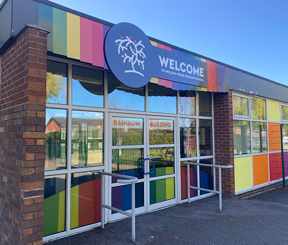
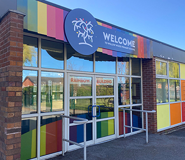
Main Reception Area
To completely transform the main school reception we created both window graphics and a sign for above the doors. The sign is made from two panels with the overlaid panel being fitted with raised locators, making it stand off and giving it that extra wow factor.
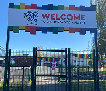
Nursery Entrance
We created a bespoke entrance sign for the Nursery, this sign was fabricated from powder coated aluminium posts and two printed aluminium fascia boards, one for each side.
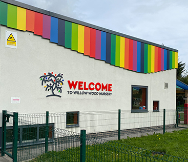
Nursery Building
Stand off acrylic lettering was used on the Nursery building to create a welcoming feel and tie in with the striking multi coloured cladding used around the building.
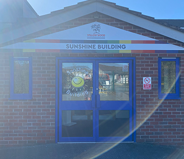
Sunshine Building
A bespoke panel sign was created to follow the shape of the apex roof for the Sunshine Building.
Signed, Sealed & Delivered
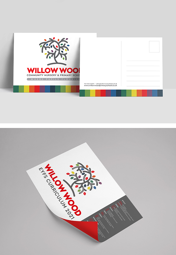
Alongside Willow Wood’s new branding and signage, we also created new postcards and curriculum graphics for their school. Utilising the new branding and bringing in their new bold colour scheme and stylisation, we designed these fantastic postcards. These postcards are easy and clear for the reader to understand, whilst showcasing the achievements the children have made.
Tasked with incorporating Willow Wood’s school curriculum into interesting and branded graphics, we created unique and informative visuals that reflect the school’s ethos whilst introducing their new branding. Another fantastic design created by our team at Education Office.
Just The Beginning
This is just the beginning for our relationship with Willow Wood, we’re super excited to continue to work closely with their team to develop their brand further and collaborate on even more projects. We created new and unique designs to ultimately help raise the profile of the school and increase the pupil numbers within the school.
As education specialists, we pride ourselves in our ability to push the boundaries of creativity whilst working within set budgets and timescales. With a team of in house experts on board, we can help you with specialist and cost effective design, print and marketing services. Whether you need a new website, school signage or photography, our team has you covered. For more information about how we can help you, fill in the contact form below and a member of our team will get back to you as soon as possible.